An imprint for Montreal — UNESCO City of Design.
A stencil's outline, letters in motion,
the weave of a map — the shape of a city, ours to reinvent.
Design impresses its stamp on the cityscape.
" In 2008, two years after Montréal was designated a UNESCO City of Design, the Réalisons Montréal, UNESCO City of Design project was implemented in order to stimulate design creation in Montréal and showcase initiatives in this field. A competition was launched to create a new visual identity for the project, and the winner was FEED, an independent graphic design studio. The identity it submitted is based on a graphic interpretation of the urban grid and evokes the notion of construction. It invites designers to make Montréal and to be proactive agents in the city’s future.
On the occasion of the designation’s fifth anniversary, the project’s identity is evolving. With a history of strong accomplishments, all Montréalers are now invited to openly display their recognition of the role of design in Montréal’s development. Since we are already firmly engaged in creating the aforementioned future, Montréal, UNESCO City of Design is now being expressed in a simpler, bolder way.
Graphically speaking, this shift translates into a change in scale. There is a feeling of closeness to the goal, progress. There is a movement toward a sort of simplification. The colour palette is reduced, the plays on transparency are being left aside. The symbol that accompanies the project’s graphic signature is imagined as an imprint, a form of stamp offered to all Montréalers, who are invited to share it and use it for themselves. It evokes the cut-outs of a stencil, a typeface in movement, the street lines on a map, the shape of a city: Montréal, City of Design. "
-Anouk Pennel, Studio FEED, April 2011
To highlight the fifth anniversary of the designation of Montréal as a UNESCO City of Design, our partners are invited to show their support for this recognition of Montreal’s growth through design by using the Montréal UNESCO City of Design label on their printed and eletronic communications.
By downloading the Label you agree with the values of Montreal UNESCO City of Design:
Click here to download the color label
Click here to download the monochrome label
Click here to download the inverted label
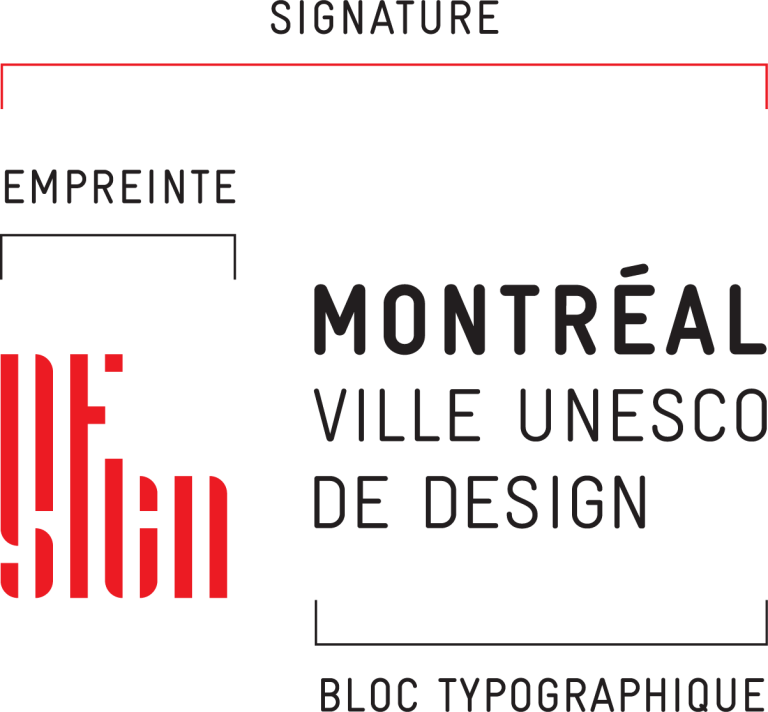
Components
The label is composed of two parts: the imprint and the Montréal UNESCO City of Design wordmark.
The label must not be altered.
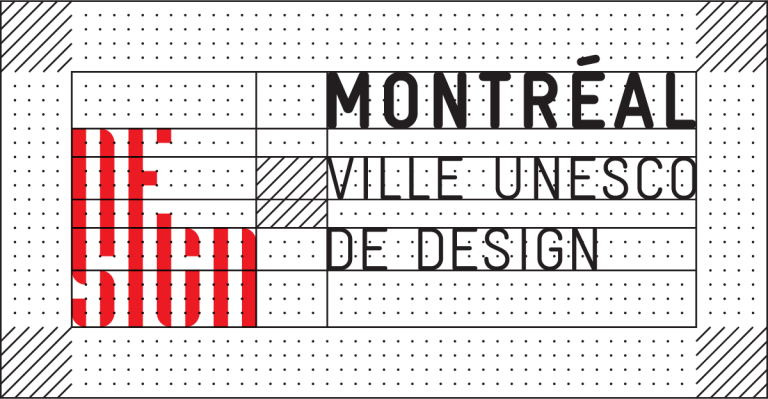
Clear Space Area
A clear space area surrounds the label. It corresponds to the space between the imprint and the wordmark. It is important to keep the clear space areas free of text or any other graphic elements.
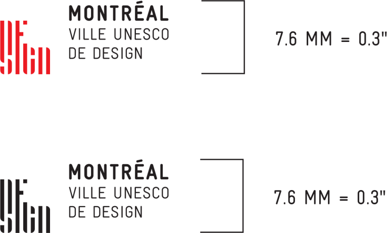
Minimum Size
The Montréal UNESCO City of Design label can be reduced in function of available space as long as its minimum size of 7.6 mm in height is abided by.
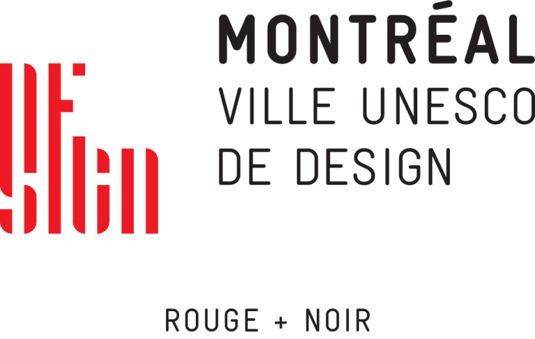
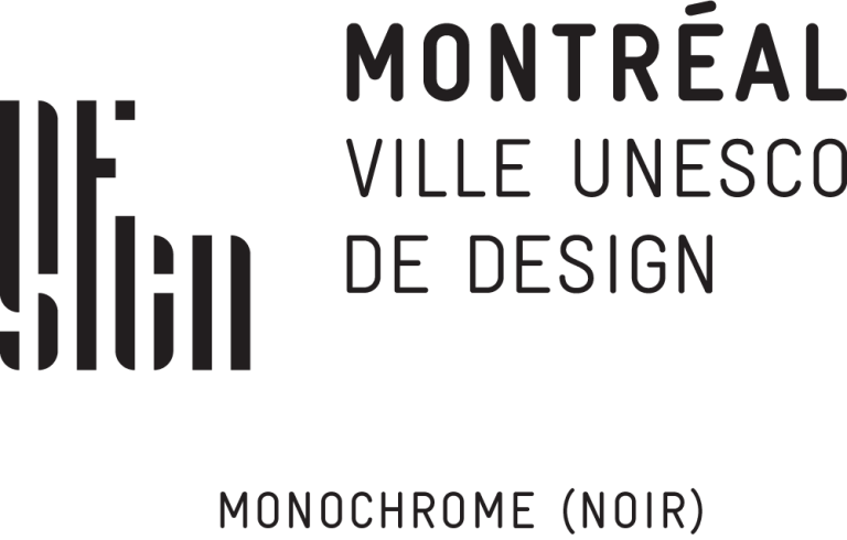
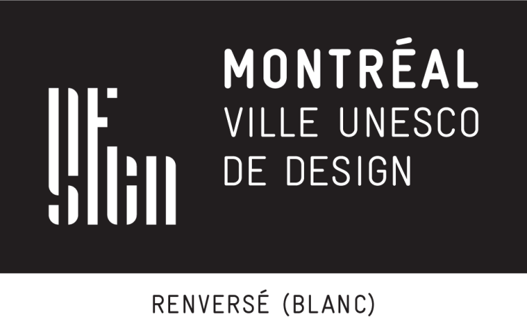
Coulours
To ensure optimum visual impact, the label is used in its two-colour version, made up of primary red and pure black. Monochrome versions of the label can also be used. The black version is used on a light background. On a dark background, the label is used in white. No version of the label can be converted to grayscale.


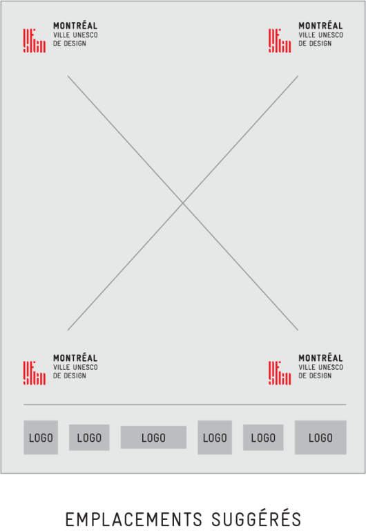
Positioning
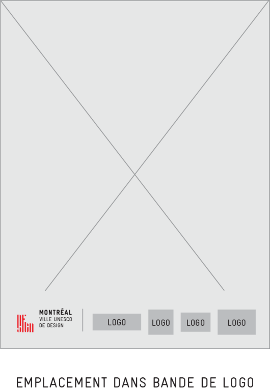
The label is positioned in the corners of communication pieces. It is placed there respecting its clear space area and minimum size. When necessary, the label can also be placed in a logo strip, respecting its clear space area and minimum size.
To highlight the fifth anniversary of the designation of Montréal as a UNESCO City of Design, you are invited to show your support for this recognition of Montreal’s growth through design by using the Montréal UNESCO City of Design imprint to create your own promotional pieces or personal projects.
By downloading the Imprint you agree with the values of Montreal UNESCO City of Design:
Click here to download the color imprint
Click here to download the monochrome imprint
Click here to download the inverted imprint
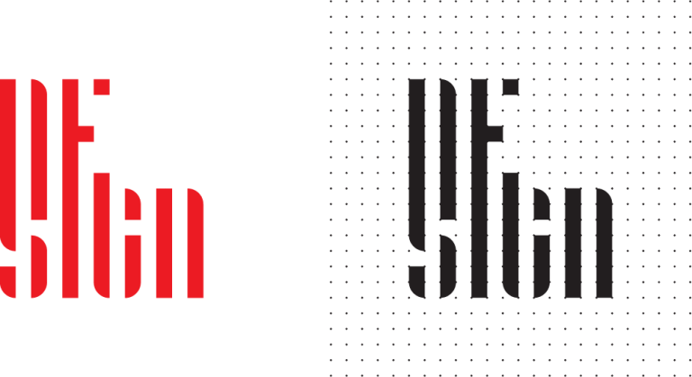
The Imprint
The Montréal UNESCO City of Design imprint is constructed on a grid measuring 13 units in width by 14 units in height. The imprint represents an indivisible unit.
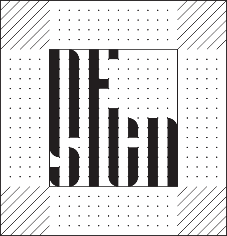
CLEAR SPACE AREA
A clear space area surrounds the imprint to ensure its legibility. It corresponds to a 5 unit square.
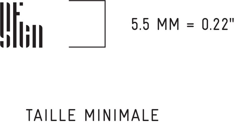
SIZE
The imprint can be used in any size as long as its minimum size of 5.5 mm in height is abided by. There is no maximum size for the imprint, it can be enlarged as you see fit.
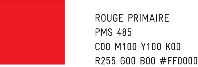
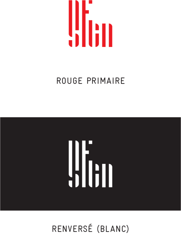
COLOURS
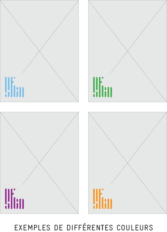
The imprint’s initial colour is primary red. However, to encourage its appropriation, it can be used in the colour of your choice. On a dark background, it is used in white.
POSITIONING
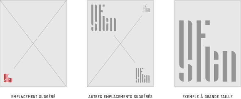
It is suggested to position the imprint in the lower left corner of your promotional or personnal pieces. When necessary, the imprint can also be placed in one of the other four corners of the application, or any other clear area where it can be properly displayed.